UX/UI: PlanPal

Role : UX/UI Designer / User Researcher
Duration : 12 Weeks
Tools: Figma, Miro, Google forms
Background
Planning a trip should be exciting, but for many, it’s a stressful and time-consuming process. Information is scattered across multiple platforms, group coordination is a hassle, and personalization is often limited. As a result, travelers spend hours comparing options, juggling messages, and struggling to stay organized.
Our team set out to understand these frustrations by analyzing leading platforms like Expedia and TripAdvisor. Through competitive analysis, surveys, user interviews, and usability testing, we identified major pain points, from overwhelming decision-making to clunky booking experiences.
These insights guided us in designing a more intuitive platform that simplifies travel planning and booking experience and most importantly solves identified user problems.
Lack of Seamless Coordination
Unclear Booking Details
Rigid Planning Tools
Goal
Our goal was to evaluate existing travel platforms, identify their strengths and weaknesses, and uncover unmet user needs, design a user-centered solution that combines the best features while addressing key pain points, making group travel planning more seamless and efficient
Competitive Analysis
We analyzed Expedia and TripAdvisor to identify their strengths, weaknesses, and design gaps. Expedia stands out for its exclusive discounts and bundled packages, making travel more cost-effective. TripAdvisor, on the other hand, excels in user engagement through reviews, travel stories, and active community forums.
However, both platforms present usability challenges. Users often struggle with TripAdvisor’s confusing navigation when dealing with third-party sites, while Expedia lacks flexible booking options, making the process less convenient. These gaps reveal key unmet needs, such as streamlined booking, transparent pricing, and personalized recommendations, guiding us in designing a more intuitive travel platform.
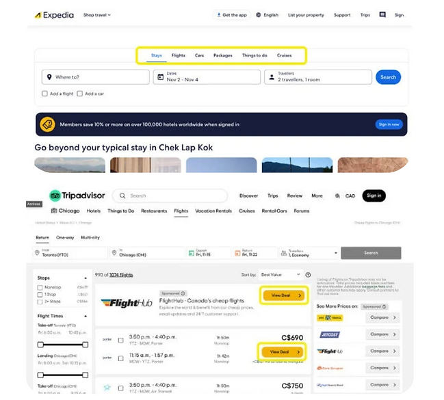
Heuristic Evaluation of the interfaces of Expedia and Tripadvisor website
User Survey
We conducted a user survey to gain quantitative insights into travel planning and booking behaviors. The survey targeted both experienced users of travel platforms and those new to them, focusing on platform preferences, desired features, booking frequency, and usability perceptions. The findings provided valuable data to inform the design of a more user-centered travel booking solution.
User Interview
We conducted user interviews to gain qualitative insights into trip planning and booking experiences. Using open-ended questions, we encouraged participants to share their challenges, preferences, and pain points in detail. Follow-up questions helped uncover deeper themes and nuanced frustrations. These insights played a crucial role in shaping our design decisions, ensuring the solution directly addressed user needs.
User Interview Iterations
Before Prototyping
The first round of interviews were conducted before our low-fidelity prototype. The aim was to collect data on user needs, behaviors, and preferences through their real experiences with current travel platforms. The data was analyzed alongside our survey results, using the usability issue prioritization technique.
Low-fidelity
The purpose of the feedback was to gather initial opinions on our low-fidelity prototype and test fundamental ideas. The prototype was shared with target users who provided suggestions for improving layout, flow, and functionality. Through this, early-stage refinements were made to ensure prototypes aligned with user expectations before further development.
Medium-fidelity
During medium-fidelity prototyping, the team directly observed invited users as they performed specific tasks on the prototype. The team also took down notes on user behavior, including errors made during the testing. Think-aloud protocols were also used, where users verbalized their thoughts about completing specific tasks.
Thematic Analysis
We used thematic analysis to identify patterns and themes from interview data and feedback. The team first familiarized themselves with the data to understand user experiences. Then, we assigned codes to specific ideas or feelings expressed by participants. After grouping related codes, we identified key themes, usability challenges and desired features that best represented user feedback. Finally, we categorized the data into two main themes: Value of convenience and Gaps in content and information clarity.
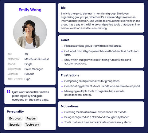
User Persona
We created a user personas to represent a typical user of the travel platform, based on insights from user interviews, surveys, and secondary research. The personas captures key behaviors, needs, and pain points, ensuring that the design remains aligned with real user experiences.

User Journey
We created a user journey map to understand the end-to-end experience of users like Emily on a travel booking platform. This map helped identify key pain points, emotional triggers, and opportunities for improvement.
Key insights from the journey map included enhancing filter functionality during the Discovery stage, improving transparency during Decision, and offering clear, secure, and collaborative payment options. These findings guided the optimization of Emma’s journey, ensuring a seamless and positive user experience

Usability Issue Prioritization
We created a usability issue prioritization chart to identify tasks based on their user value and ease of implementation.
In the top-right (green) quadrant, we prioritized high-value, low-effort tasks such as price comparison, combined flight and hotel checkout, and travel planning tools like split bills and itineraries. The bottom-right quadrant highlighted more challenging features, including real-time trip updates, social media integration, and AI-supported trip curation. Lower-value features, like badges and gamification, were placed in the left quadrants, indicating they were less urgent. This prioritization allowed us to focus on high-impact tasks for maximum user satisfaction and efficient resource use.

Results & Decisions
The team collaborated closely to finalize research plans and complete tasks according to our timeline. We organized the collected data and insights from shared documents, guiding the product development process.
Through competitive analysis, surveys, user interviews, and usability testing, we identified key design opportunities to enhance the platform's value and usability. These included features like price comparison, split-bill functionality, trip timelines, detailed user reviews, travel safety advice, curated trips, and support for flight and hotel changes. By incorporating these features, we can provide a unique, user-centered travel planning experience that addresses competitor gaps while emphasizing convenience, clarity, and personalization.
Low-fidelity prototype
We used Figma to turn our initial design ideas into low-fidelity wireframes. The prototype consists of five key sections: Landing Page, Price Comparison, Timeline, Social Media, and Authenticated User Reviews.


Usability Testing Results-Affinity Map
The affinity map grouped user feedback into key categories to improve the travel booking experience.
From user testing, we identified several priorities: simplifying flight changes with clear policies and better refund windows, offering cheaper tickets through discounts and flexible pricing, and supporting decision-making with features like price comparisons and split-bill functionality. Users also valued curated trip options that suggest personalized itineraries and activities. These insights help prioritize areas for enhancing satisfaction and usability in our product.


Medium-fidelity
Building on insights from user testing, the mid-fidelity design refined the user flow and divided the Planpal website into two main functions: booking and planning.
The wireframes allowed users to complete key workflows, such as booking flights, adding items to the cart, and creating and planning their trips.

Usability Testing Results-Thematic Coding
The thematic coding analysis revealed two key themes from our medium-fidelity user testing: (1) Value of Convenience and Key Features and (2) Gaps in Content and Information Clarity.
The first theme highlighted users’ appreciation for the prototype’s convenience, especially features like cost splitting and price comparison, which align well with user needs. The second theme identified gaps in content and issues with the clarity of presented information. Missing or unclear details about accommodations, local recommendations, and certain features, like social media integration, hinder the prototype’s usability and trustworthiness.

High-fidelity
Building on the insights from usability testing, we created the final high-fidelity website prototype in Figma. The design incorporated four key features to address the usability issues identified earlier, ensuring a more intuitive and user-friendly experience.
Implications & Recommendations
Short-Term:
-
Iterate current features to capture wider range of users.
-
Expand research for accessible design
Long-Term:
-
Add flexible refund policies
-
Develop curated trip suggestions powered by AI
-
Integrate real-time updates
Conclusion
The project taught me a lot about designing for collaboration and convenience. I realized how challenging it can be for groups to coordinate and make decisions, especially when dealing with different budgets, schedules, and preferences. Through research and testing, I learned that people value simplicity and clear communication. Overall, this project reinforced my belief that great UX is about reducing friction and making complex tasks feel effortless.